Mistake #3. A Website Design That Gets in the Way of Good User Experience
You are the expert and will remain the expert if you keep ahead of your rivals. Keep up with web design trends. Create a clear understandable, consistent-usage, user-friendly “I like that” website. Add photographs that entice potential clients to stop long enough to be interested and confirm they’ve come to the right place.
Keep up with the Latest Trends in Design. Do Not Go against the Trend
For example, in 2016 flat design was trendy. Using comments, exaggerated shadows, and 3D effects were big don’ts. Keep it simple and clean and add only subtle details. Follow the trend setters for an attractive look and feel. Just check what Apple, Facebook, Google use on their websites and you’ll get the big idea.
Create a Screen-Friendly Brochure
Not all of us will read your amazing guide on desktop. Be sensitive. Don’t go below 12pt or even better 14pt. Maximise the readability of your text. Good font size, spacing, alignment, line length, colour, text and background will make your guide much easier to read.
The company in this example got it all wrong. While their design is maybe ok for print, it is not at all ok for the screen.
- The 9-point fonts are way too small
- The portrait orientation does not work for laptops
- There is far too much text
They do help us scan the text by breaking it into sections and the contrast is not that bad. The overall feeling though is “oh my god I wish I had this printed before leaving the office”.
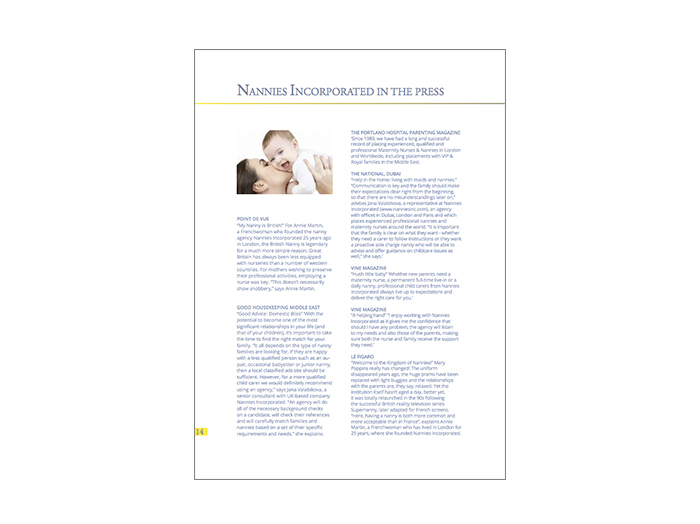
Example of screen-unfriendly online brochure leading to a poor online user experience
Do not assume people will print your brochure! This is simply wrong from so many points of view. Environment, User Experience, Convenience, Our whole lifestyle in the 21st century. You put your brochure online, make it screen friendly!
Check this as an example from our client Nanny Express to see how to get it right.
- They used large fonts (32, 16 and 12 points)
- Great contrast
- 3-level hierarchy for the text
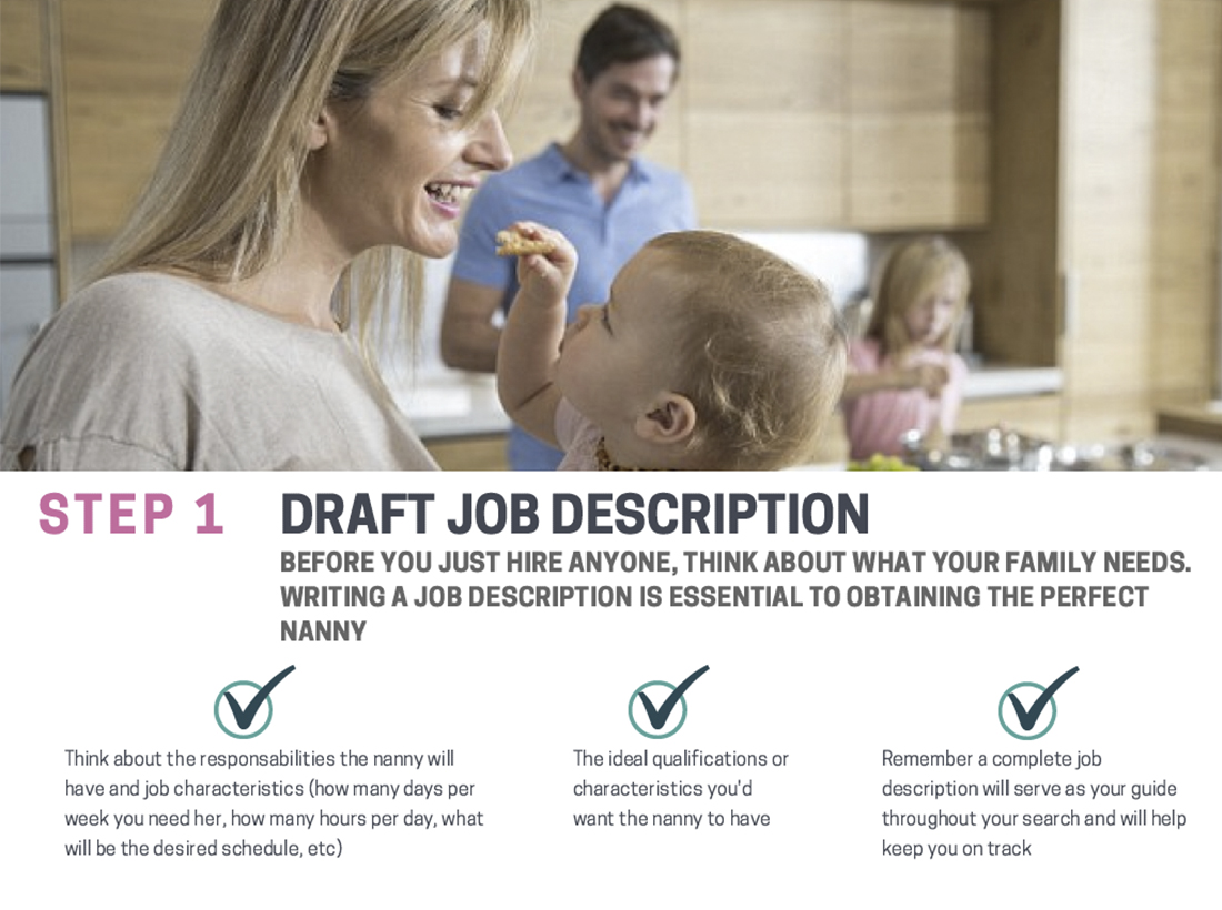
Example of screen friendly design for an online educational guide
Choose Wisely. Choose Landscape
Computer monitors have a landscape orientation, so if your PDF brochure has a portrait orientation (say, vertical 8.5×11), the viewer will have to do one of two things. Look at the whole page in total, which will be quite small because of the wasted spaces on both sides of the screen, or the width of the page can fill the screen when scrolling from top to bottom. It’s the same for online brochures and e-guides. If your potential customers read them online, landscape is better than portrait.
Be Consistent about the Way You Write Your Titles
Almost everything goes here. Capitalized, lower case, capitalizing words with four or more letters Chicago style. But be consistent. We prefer the Chicago style but sometimes our copywriters are not happy about it. Go Chicago, go API, or just capitalize words with four or more letters.
How can you do it without enrolling for a Ph.D. in professional editing? This might help you if you are the copy-paste type: http://titlecapitalization.com/
Choosing Fonts Smartly - Legibility Over Funkiness - Why I Don't Love Garamond Anymore
Use a maximum of 3 fonts, preferably 2, and ensure your body text font is easy to read. Go for a sans serif font rather then a serif font. This will improve legibility. Funky fonts are ok for emphasis but your body text font must be legible! Ask a designer friend how you can pair up the fonts. If you get no help play safe.
You can get some combinations that work together here:
https://www.canva.com/font-combinations/
Almost forgot. Do you want to know about Garamond?
Back in the days I used to love this font and use it across the board. Until our branding consultant told us the story about this 5 centuries old font. Unsurprisingly enough, it was invented by Parisian craftsman Claude Garamond in the 16th century. Although popular among French engravers it is not ok for sophisticated devices of the 21st century.
Helvetica Neue is the new Garamond.
Use Seductive Photos to get Your Potential Clients to Download and Read Your Online Guide
A Picture Is worth a Thousand Words. Yes, it is a cliché. But it’s also true. Make your point by showing potential clients how uncomplicated their lives will be when they sample the benefits your solution provides. Use seductive or aspirational photos that can propel your readers into the future where their problems are solved (by your product or service). Voila! A nicely designed cover using an aspirational photo, a title and a subtitle is a great idea since this cover will be featured on your landing page or in the opt-in form on your website.
Keep the design simple and clean. Do not go overboard with stock photos. Real photos telling the actual story of your business are more authentic and convincing. Look how Nanny Express pictured the dream of every parent. These children are in good hands. Oh, just what we’re looking for! Who are these guys?
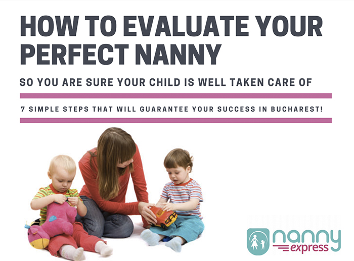
The cover of this digital guide beautifully illustrates the main promise of the brand of this company
An alternative approach that works just as well is to use a photo to reassure potential clients it is for them.
Use Photos to Tell Visitors “Yes, You Are in the Right Place” so They’ll Stay on Your Website
Xelf studio is a gym in Hamilton, Ontario, Canada specialising in training beginners to get fit and adopt an active lifestyle. One of our “Online Website Reviews” assessed their website and we loved what we saw. Look how masterfully the photo shows who it is for. And how beautifully the copy and the visual components reinforce each other.
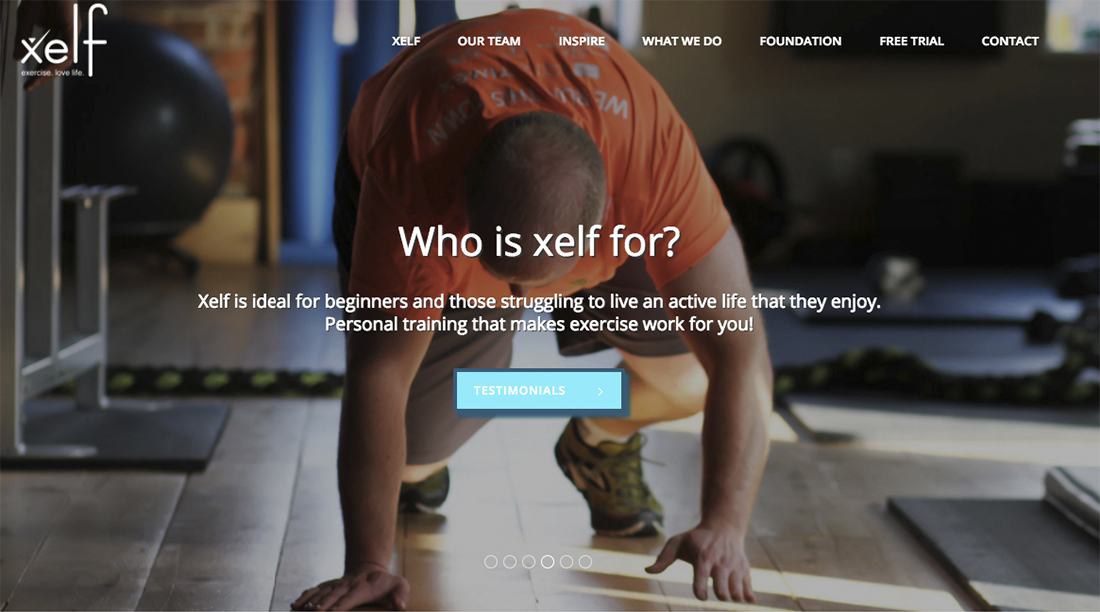
Use photos to qualify and seduce your ideal audience. The photo featured by this gym on its website is an excellent choice because it is directed at its ideal clients. This gym is all about inspiring people just getting started to get in shape and the photo convincingly depictsis such a person. DUKE
As I recommended in the “Online Website Review Session” Xelf needs to fix the call to action button. A high contrast combo would also greatly improve the user experience of this otherwise outstanding website. White text on light blue is never readable enough.
The Holy Trinity: Title – Subtitle – Body Text
Title – subtitle – body text is the holy trinity of text hierarchy. It never gets old! See how this structure helps to effectively build the case for 3D Property Tours.
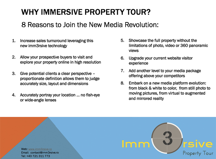
Use a text structured on 3 levels to make it easy for the reader to get the big picture about your online brochure in the blink of an eye.
Why is this structure effective?
The title attracts initial interest by mirroring questions potential buyers have in their heads. Why should I go for it? The subtitle qualifies the early adopters of new technologies. This is intentional, as the target audience of Immersive Property Tour are technophiles and the company is recruiting their early adopters. The body text, a bulleted list in this case, gives compelling reasons for the potential buyer to go for it. Many Reasons always sound better than one and some NLP gurus claim to have magic properties. Our client loved all the above 8 reasons so much we simply couldn’t leave any of them out.
Use a Clear 3-Level Structure to Drive Your Point Home on Your Website’s Homepage
Let’s look at two webpages now.
The yoga challenge page has all the “must have” information on the page. However, the structure is not adapted for people reading from their screens, desktop or mobile. There is no obvious dominant message on the page. Visitors need to scroll down in order to find the call to action button which takes them to the “opt in” form.
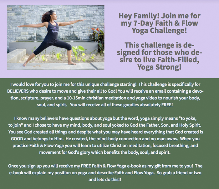
In this example the structure of the webpage leads to less than perfect user experience. The lack of a clear hierarchy of messages makes it difficult for the visitor to see in the blink of an eye who the site is for. There is also no clear quick explanation of the problem to be solved or benefits to be delivered or what the user can actually accomplish on this page.
Our client, Insight for Good did a better job. The hierarchy of the messages and a clear call to action placed above the fold makes very clear the main message, also known as the value proposition.
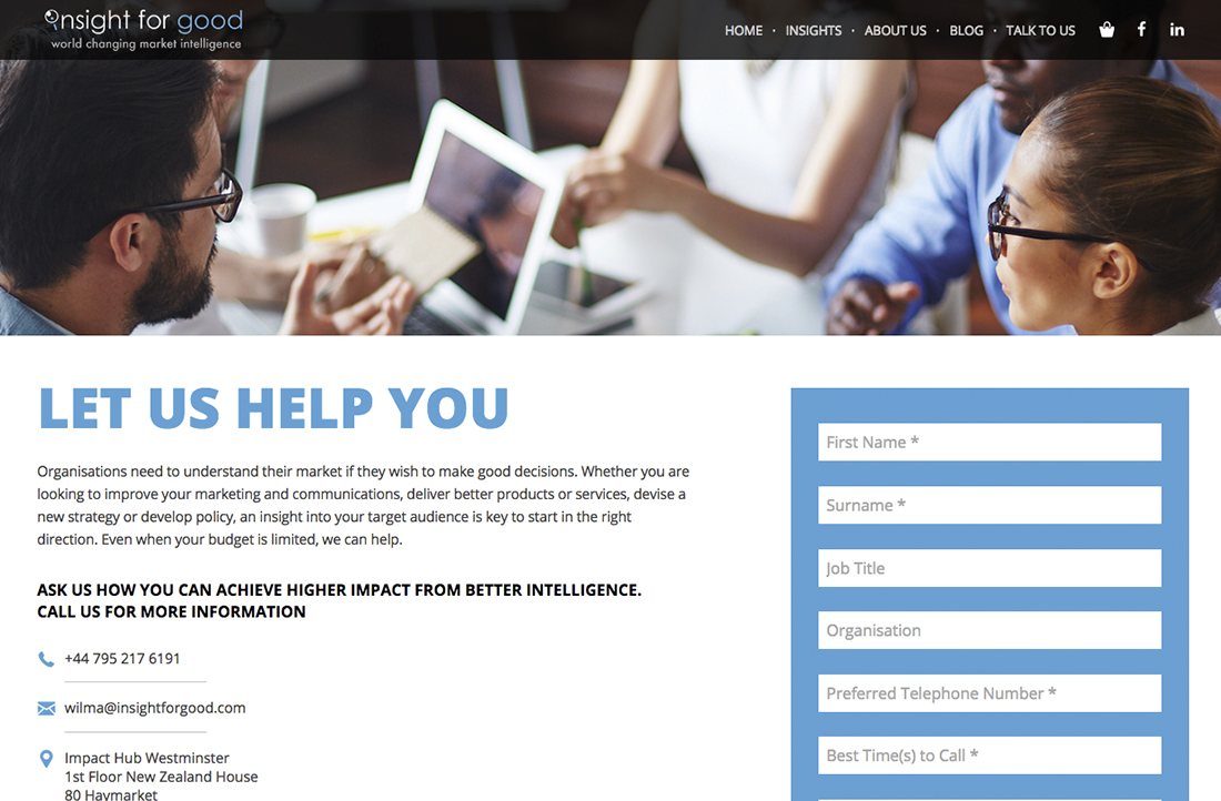
Here a clear 3-level hierarchy makes it easy for the visitor to see in a blink of an eye who the site is for, the benefits to be delivered and what the user can accomplish on this page
Insights for Good could still improve this by using a more to the point headline, such as “Get in Touch to Achieve a Higher Impact from Better Intelligence”
Design the “above the Fold” Section of Your Webpages Smartly
The “above the fold” section of a webpage - the part of the webpage your visitor can see without scrolling down is the most valuable online real estate on any webpage! Why? Because this section will make or break the success of your website or landing page as a marketing tool.
Most people would not scroll down to see the rest of your page unless from the moment they land on your page there is something in it for them. If you don’t sell the idea here that you have something of value for your visitors they will simply press the back button or the little X in the corner of their browser. And we all hate to see bounces in Google Analytics. So the main question is how do you show in the blink of an eye, your products, services or solutions are something of value? See below how our client, Insight for Good, does it.
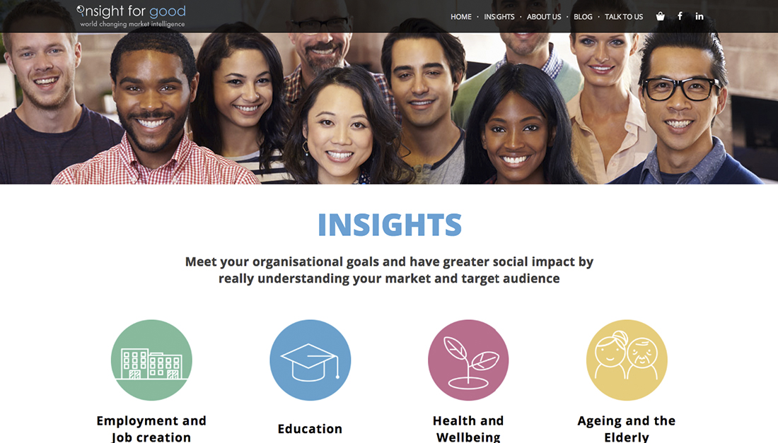
Who is it for? Organizations from certain niches who want a deeper insight into their target audience for better results
What’s in it for them? They really understand their markets so they perform better and have a greater impact
What are visitors expected to do? Choose their sector and find out what Insight for Good has in store for them.
See how beautifully Insight for Good answers all three questions featured at the beginning of the article. The visitors can see them without looking for needles in the haystack. Is it for them? What benefits do they get from the information the site presents? What’s the next step to get these benefits? We do not want small text we can hardly see. We want no distractions, no fluff. We want ppace to breath.
We do not want too much information? We do not want to be lost in the deep forests of cyber space.
What to improve:
Well, we do need to scroll down a bit to find this out but it is something that could be easily fixed. See below how seeing a call to action makes everything much clearer. Of course by face-lifting the design the photo also shows properly.
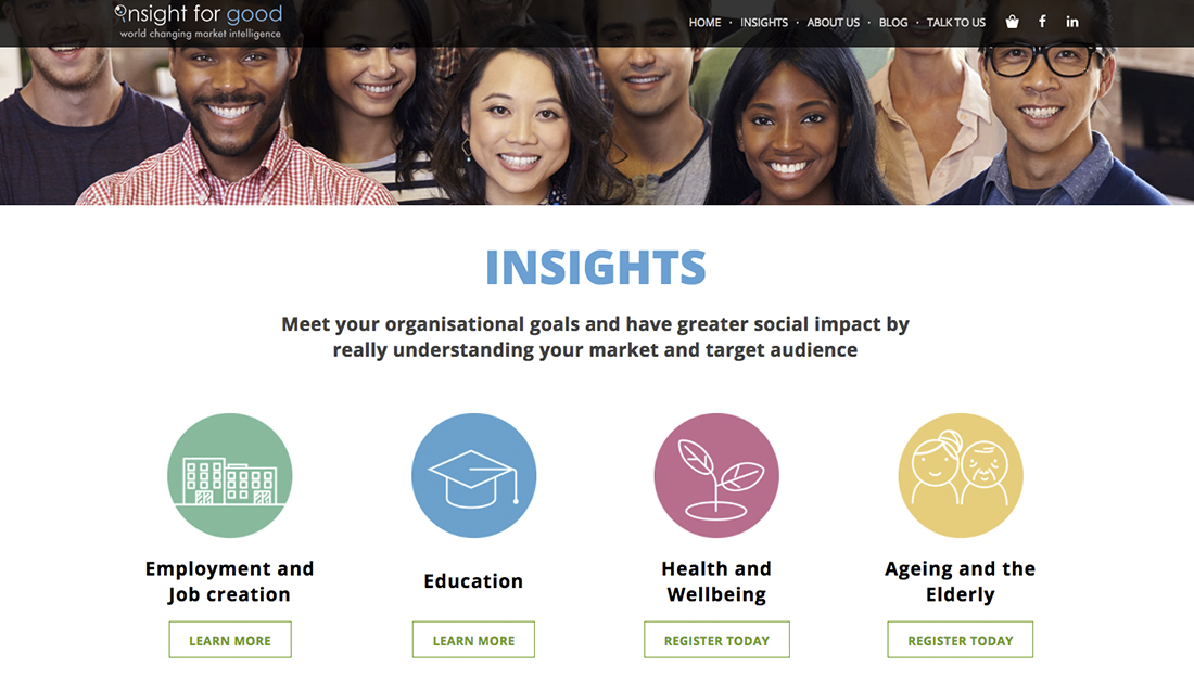
Placing the call to action buttons above the fold makes this webpage much clearer and increases the chances of people taking actions they are expected to take. DUKE
How to Design a High-Conversion Opt-in Form on Your Web Page
Let’s take another example and see how a clear message hierarchy can help you design a high performance opt-in form.
This is critical since one of the main objectives of your website is, or should be, to turn your visitors into contacts on your email list. Or, as digital marketers would say, to generate as many qualified leads as possible. How does Anastasia achieve this?
Anastasia is a career coach for millennials and we got to meet her online because she submitted her website to one of our online Website Review Sessions. I loved the way she conceived her website and designed it for the purpose of generating good leads for her coaching services. Let’s take a look at the way she designed the opt-in form she placed on her homepage to generate qualified leads. Her strategy is very good. She is offering her latest book for free to her potential clients and thus, collects their email addresses. A perfect example of lead generation on autopilot.
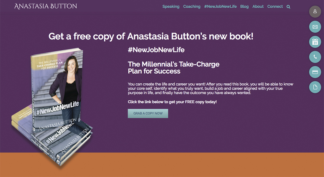
Placing the call to action buttons above the fold make this webpage even more clear and increases the chances people would take the action they are expected to.
How does the 3-level hierarchy work here?
Level 1 – A clear Title tells exactly what it’s all about (a book) and what’s in it for the user (free copy)
Level 2 – The Subtitle Spells out the main benefit the user gets from reading this book
Level 3 – The Body Text gives more benefits to make the visitor play along, download and read the e-book.
The clear straightforward and custom-written call to action is also a “must have” for a successful opt-in form and Anastasia got it right.
How much more powerful is this than “Download my latest book” or, God forbid, “Subscribe to my newsletter”?
Could We Make this Opt-in Form Even More Powerful? [Makeover example]
Absolutely, we can. I would put in the main headline the main benefit the reader would get form this book. The cover of the book already shows that it is her book so it is not really necessary to communicate this in the headline. Ok, so I’m a millennial in search of the best career options. What is more exciting for me: to read a book written by a career coach or to design my own plan for success with the help of this coach? I’m compelled to download something that helps me to take charge of my career. It’s far more important than simply downloading a book.
Makeover Example
Take Charge of Your Career
Get your free copy of “The Millennials’ Take-Charge Plan for Success”
Discover in Anastasia’s book
• How to know your core self
• Identify what you truly want
• Build a job and career aligned with your life’s true purpose and finally
• Achieve the success you want and deserve.
Start now creating the life and career you want!
Grab your free copy now
Design Issues regarding Opt-in Forms
Here Anastasia got almost everything right.
- Using the nicely designed cover of the book to opt-in not only to tell, but also to show what you can download
- Excellent contrast for the text
- Good text structure to reinforce the hierarchy of the messages
- Good color scheme
- Screen friendly fonts
Make Your Calls to Action Pop Up
What should be improved is the call to action button. The grey on light blue contrast doesn’t work.
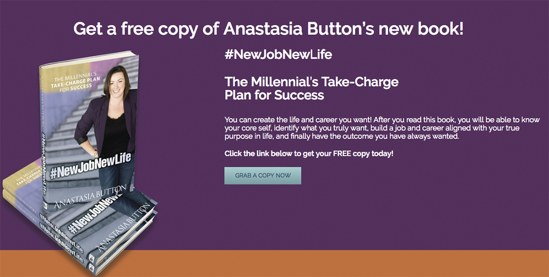
This is an excellent example of how to sell the opt-in and the design reinforces the good copy. Using a higher contrast call to action button would make this even better as it would be easier for the visitor to read.
The solution is obvious and Anastasia is using the right contrast in other buttons on her website. See how the readability is improved in the button form her contact form. The white on blue contrast works so much better.
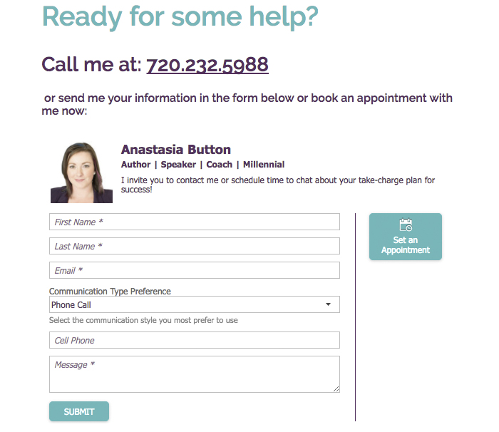
Bigger buttons with bigger fonts will be even better.
Now that the new call to action (“text in the button”) is more visible we don’t need to repeat information about the “free copy” in the text. Instead of repeating info not visible enough we can use this valuable online real estate to give the visitor an additional reason to take action now. That’s why I included “Start now to create the life and career you want”. It creates a sense of urgency and gives a compelling reason for Anastasia’s visitors to click now, rather than later. Which in most cases, is never.