Mistake #1. Not Being Clear about Your Strategy
Most entrepreneurs start building their online assets for their own needs rather than their customers’ needs. Yes, it’s hard to focus constantly on your client when you’re so excited about your services. So how do you get clients to love your services as much as you do?
Start by asking the right questions.
Who Is Your Webpage, Online Brochure or Digital Product Aimed At?
Think strategically about your customer’s needs and how your product solves them. Your strategy starts here. Your message starts here. A successful brochure, guide or website starts here.
Follow this advice and you’ll be ahead of the pack. Most people don’t get it. It’s not about them, their company, their product, their features, their product launch.
You do not build your brochure, guide, or website for you or your team. You build it for your potential client. Otherwise you’ll be the only one browsing your website or reading the guide.
How do you help your potential clients fall in love with your product? By spelling out the ways your product makes their lives easier, from their viewpoint.
Your first step is to convince potential buyers, what you’re selling is for them.
How Do You Show Online Who Your Solution Is For in the Blink of an Eye?
This is from a landing page our team built for Donna Divina Romania. The objective of the campaign was to get people to apply for an exclusive high-ticket retreat.

This landing page makes it clear above the fold who the event is for through all the elements: headline, text and photo. The users don’t have to scroll down to understand what they can get. This is the first step towards attracting the right visitors and turning them into clients .
Note how the photo answers the question “Is this for me?”. In the blink of an eye, literally.
Are you a young woman, in your prime or mature? Then yes, it is for you. Are you looking to replenish your energy, live a life full of positive emotions and spread around the good vibe? Yes, yes, yes.
This picture is really worth a 1000 words. A straightforward call to action [“Get in touch with your inner beauty and rediscover the woman within”] strengthening the message and reassuring the target audience they landed in the right place.
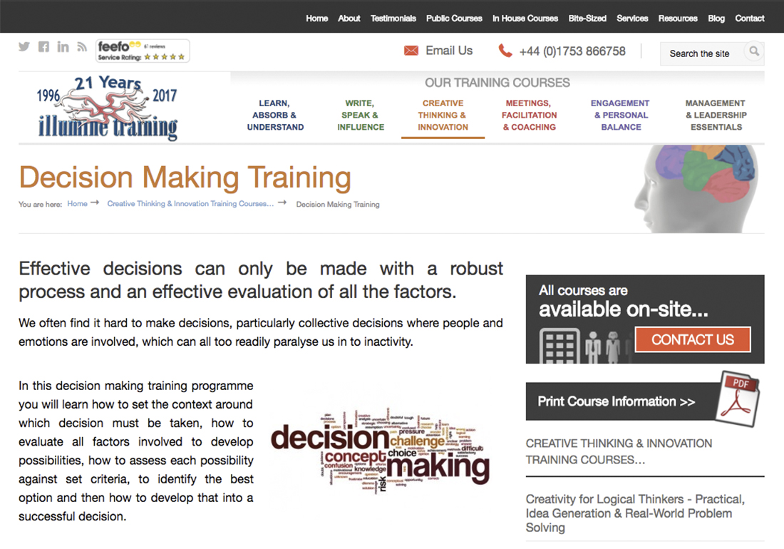
This webpage does not present the main benefits of the participant above the fold section of the page. People interested in becoming participants in this training course may feel it is for them but may also not be sure.
In this example, the training company has all the important information on its presentation webpage. Unfortunately, it fails to show immediately who it is for.
The company is very clear about its audience: professionals looking to improve their decision making skills. The problem? The webpage does not communicate this information convincingly. Not in the texts, not in the visuals.
Potential trainees cannot understand quickly enough. Why? Because the information is poorly structured. How can we say that? The heading is generic as there are countless decision making courses out there. The main promise of this training course should be much stronger and better focused on what’s in it for the trainee.
It is effective to say:
Improve your decision making skills to become a high-performance manager
and ineffective to say:
Effective decisions can only be made with a robust process and an effective evaluation of all the factors.
Effective decisions can only be made with a robust process and an effective evaluation of all the factors.
Using a better photo would reinforce the main promise of this training course. Bring in the human element and choose to emphasize an aspect of your story that’s relevant to your target audience.
The first thing I would test is a photo with a trainee team enjoying the success brought by good decision making. The existing photo could be about psychology, anatomy or anything else that has to do with the human brain. It is far too vague. It does not explain anything.
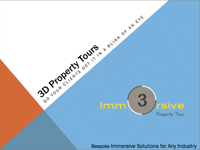
The cover of a good online brochure reveals what sort of problem the product solves.
This company’s potential clients find out from the outset that regardless of their industry they can build a 3D Tour to showcase their property and impress their own clients. The problem is that such clients have trouble convincing their own clients quickly enough about the benefits of real estate.
This company’s potential clients find out from the outset that regardless of their industry they can build a 3D Tour to showcase their property and impress their own clients. The problem is that such clients have trouble convincing their own clients quickly enough about the benefits of real estate.
The idea you get from seeing this brochure? Look, these guys could help me reach more clients interested in our apartment, office space or warehouse.
Let’s see how you can make your brochure more appealing to more potential clients.
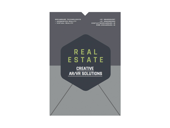
This type of online brochure cover is focused too much on the solution. Too little on the client’s problem
This company is more advanced in terms of branding and design. Most likely a professional designer produced this digital brochure whereas the previous example was an online brochure created in-house. In spite of a more professional look and feel, the strategy behind this second example is not good. Being a high-tech company it seems natural to focus on its technology. But if it means forgetting about the benefits to clients its approach is wrong.
The second company is too vague about problems that keep its client up at night. And about the benefits clients want. Most likely, its clients are not passionate about virtual and augmented reality technology. Maybe clients don’t even know what it is and how it might help them. Clients may start to care about it after they understand how such technology could help them drive more business. Most of their clients are not yet aware of this connection.
What ideas do you get from seeing this cover? Look! Yet another company providing AR and VR solutions for real estate.
Generally being too focused on your product and not enough on your clients’ needs or benefits will limit the number of people that like your solution.
Let’s see how you can make your brochure more appealing to more potential clients.
How do You Design the Cover of Your Online Brochure to Attract More Potential Clients?
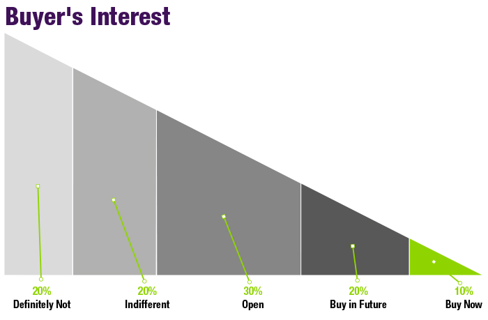
Let’s analyze different approaches from the perspective of how many potential customers these marketing tools reach.
The competitor narrows its audience to focus on people looking actively for solutions. People who know about AR/ VR Solutions and have a clear interest in it. This is around 3% of the potential market. Possibly it might be appealing to another 6-7% of people who are open to these technologies and might consider buying this company’s solution.
In contrast 3D Property Tours address the 30% of the people who do not think about immersive property tours as a possible alternative but are interested in the benefits it provides. These are people who need some sort of solution to showcase their properties and are not clear about alternatives. These are people who do not yet know there is a virtual reality solution to showcasing their property.
A slight change of angle, from selling a solution to selling the appeal of that solution and its benefits, extends your potential market by 30%. A huge difference.
Being clear about what type of problem your solution solves and/or about the benefits your clients are after, you could significantly extend the appeal of your online brochure. That’s why the way you design your cover is critical. Most people won’t even download (let alone open) this digital presentation if you fail to show them in the blink of an eye it is something of value for them.
What Do You Want Your Reader/ Visitor to Do?
The first trap to avoid is not having a clear objective for your online marketing product.
The second trap is to aim too high.
Your brochure, your educational guide and your website should all have a clear collective purpose. Do you expect your potential client to call you, send an email, fill in an enquiry form, download a pdf? Don’t go too far though. Most of these people you never met before so aim for a small low-friction conversion. It’s like a first date.
Working on a product brochure? A good call to action is for your readers to contact you so together you define what a solution for them could look like.
Include a clear call to action telling them to contact you.
A realistic objective for your educational guide is to get them hooked for a conversation with you. They read your pdf guide and found a lot of valuable information about how You could solve their burning problem. Now is a good time to meet you and benefit from your wisdom. This meeting could be a skype call, online meeting, webinar or even a face-to-face meeting, whatever makes more sense for your client, your product or your service.
Your website is a complex animal so you might have more than one objective. Be clear, at every step, about what you’re trying to accomplish. Generally, a good objective for a website is to generate the best leads. One way to do it is to ask your visitors to download an educational pdf guide via an opt-in form. Once you have their email address you can nurture that new relationship further and eventually make a sale.
Let’s take another example. Our client, Nanny Express makes it clear for the readers of their brochure what’s their next step. They also give compelling reasons to help their potential clients advance to booking a meeting and making progress along their buying journey. They also include 2 testimonials. Through clicking, calling or emailing, Nanny Express creates every possible opportunity to win client- interest in considering them as their preferred supplier.
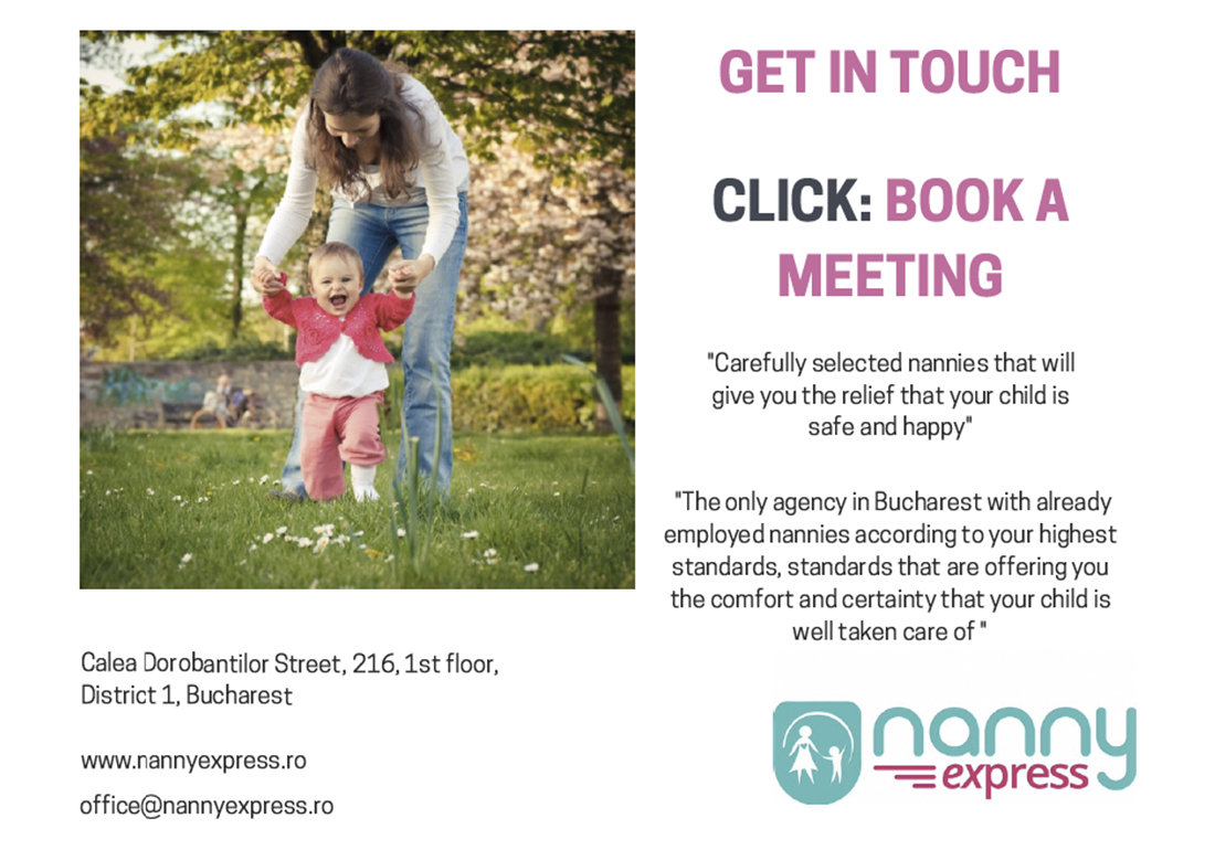
Including a clear call to action on the last page of your online brochure is recommended as well as the need to also feature some additional reason for doing so such as testimonials from satisfied clients
Now, let’s take a look at yet another approach. Unfortunately, this seems to be the standard set-up in most industries.
Not including a clear call to action in your digital brochure is confusing for the people who read it. Not featuring some inventive or social proof lowers the chances of anyone contacting you to ask for your services.
After reading all the valuable information about this long established company in the UK, I could not discover the next step. OK, I saw on the last page some phone numbers. But there was no reason at all to make that phone call. No testimonials, no discount voucher, just some information about them being in the industry for a very long time.
Such a pity since they have everything they need in their guide to create a proper call-to-action section for their online product and a proper buyer’s journey for their customers. They only need to reorganize the information from their digital brochure in a smarter, more impactful way. From the point of view of parents, having a strong need to find someone qualified to look after their children.
It’s More Than an Online Brochure! Take Your Potential Client a Step Further Down Your Online Sales Funnel
Let’s get back to Nanny Express. By clicking on its link you land on an enquiry page designed to reassure you as a parent, you are talking to the right nanny service provider.
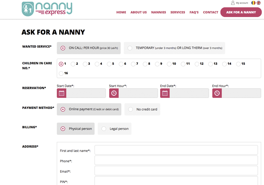
A smart enquiry form is not only a way for your potential client to get in touch with you. It is also a way to convince potential clients you are the right professional solution-provider for them.
You can see that parents can choose from all possible options: on call service, temporary or long term services. Moreover, they can choose services for more than one child . Why is it a good strategy to include this landing page as the next step for people reading about your product in your online brochure?.
Designing the buyer’s journey for potential clients this way, Nanny Express has a good set-up for collecting qualified leads on autopilot. The enquiry page is not only a way for parents looking for a nanny. It is also a powerful marketing tool. This page reassures parents that no matter what type of nanny service they want, Nanny Express is up to the challenge. Brilliant!
The same applies to websites and digital products. Don’t just get your potential client to land on your website or read your digital guide. Prepare the next step for them so you facilitate their journey towards becoming your paying client or repeat customer.